


Woolworths is an Australian supermarket chain specialising in fresh and packaged food, health, beauty and household products. As well as pet, baby and stationary supplies.
Founded in 1924, Woolworths has grown to be the largest supermarket in Australia and operates 1000+ stores across the country.
As I am a Woolworths person, I have decided to redesign the Woolworths logo not only to better fit the current brand, but to reflect the contemporary and traditional environment of the Australian grocery market.

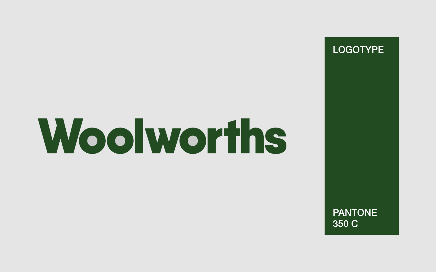
The new logotype was designed using the Qanelas Black font, which I modified and kerned to create a tight yet effective logotype. The reason for this font choice is because it partially resembles the Helvetica font used in the 1987 logo.
The logotype retains the slant on top of the t from the previous logotype.

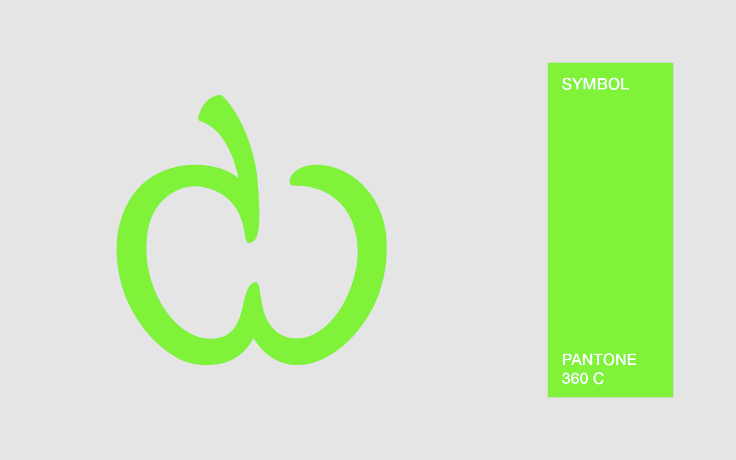
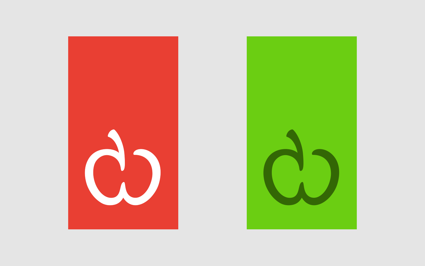
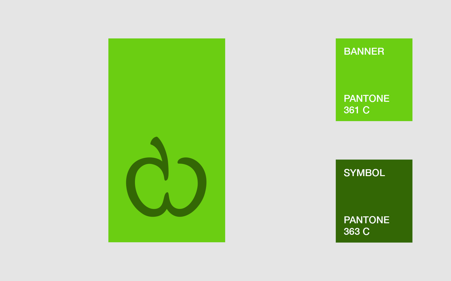
The new symbol is a single, organic squiggle shape with a stem instead of a leaf. It still symbolises an apple, but the resemblance is that it's sliced in half. The symbol once again asymmetrical and is relatively flat, in fact it has no gradients, it just has one colour.
It still has the same characteristics as the previous such as: friendliness, humanity, approachability and openness. Unlike the previous symbol, it represents that they are the fresh food people, and that at the core—it's all about the customer.
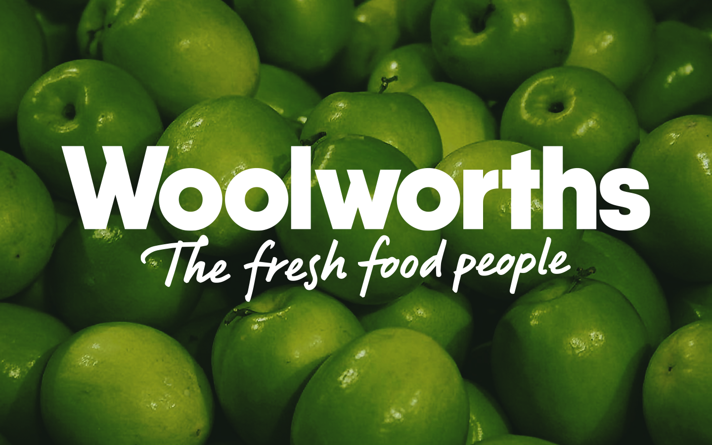
Above is the current Woolworths logo, designed in 2008 by Hulsbosch. While there's not much to say about the thin and crisp logotype, the symbol—representing fresh food, energy and nature, and bonding with 'The fresh food people' heritage is a brilliant idea.
Although the symbol alone is already recognisable, the fact that it has a gradients comes with a few problems as the colours clash with the background in some cases.
The problem that I have with the current Woolworths logo is that it sometimes doesn't fit as well as it used to. The rebrand was groundbreaking when it was rolled out in 2009. Eight years later, the Woolworths brand had changed since, sure the logo still works on a dark green background, but the problem is it hasn't really aged that well.

I started on this redesign back in November 2015, since then my initial concept evolved as I made eight revisions of the logotype.
The first revision was a geometric logotype I made from scratch. The design included green and red stripes that lined up with the proportions of the logotype, it also included the wave through r, t and h.
The eighth revision was made in January 2017, it was close to the final product with the exception of it using the Qanelas Soft font.
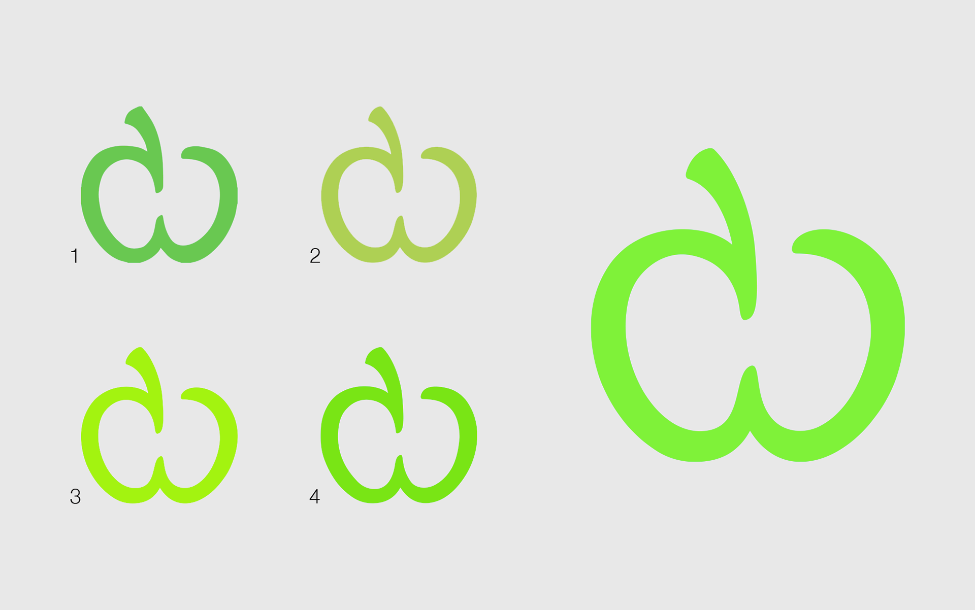
Initially I wanted the new logo to be just the logotype, but as my ideas changed I created the symbol after the sixth logotype revision, which has the same green.
The fourth symbol revision was made after the eight revision.
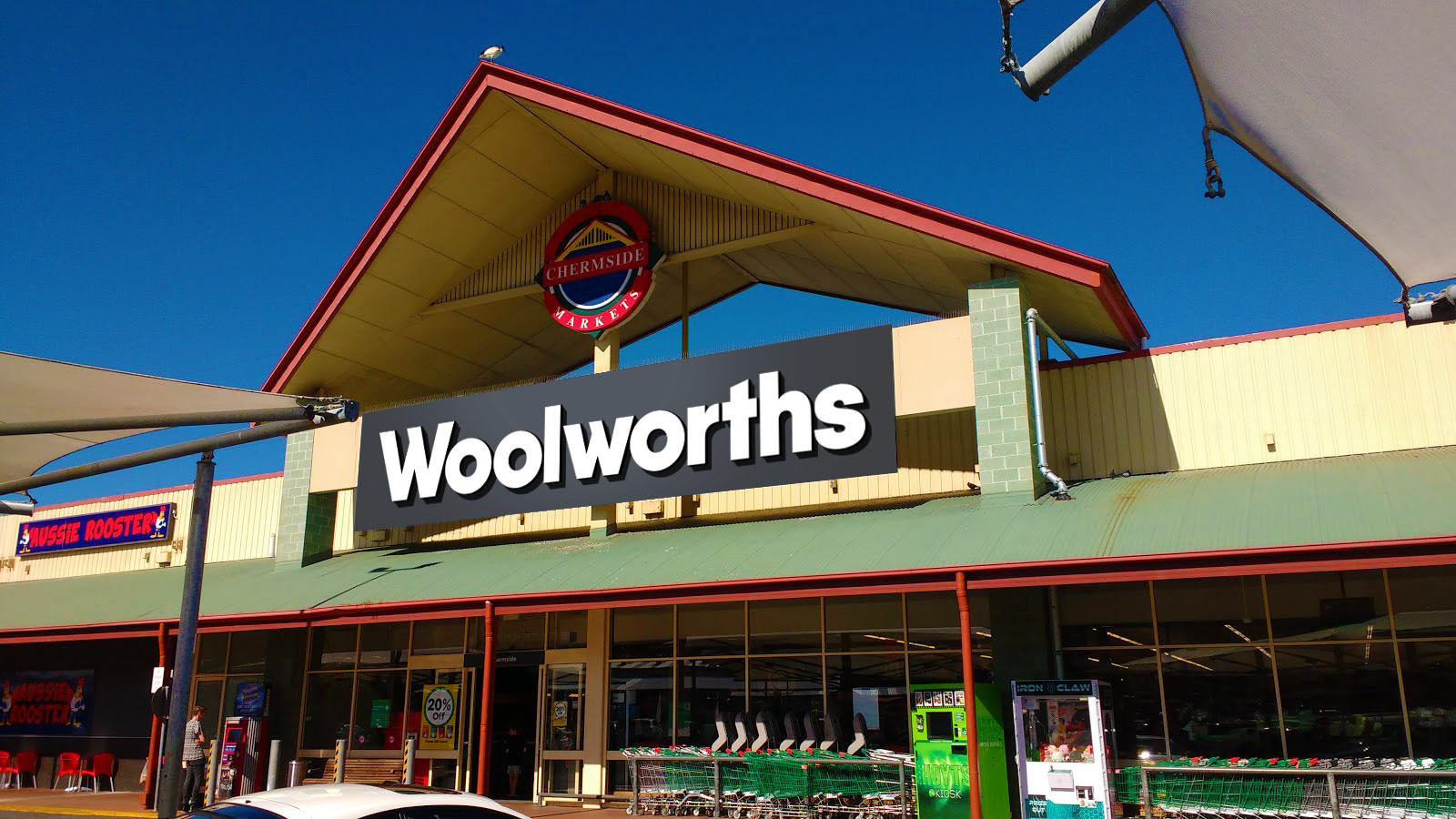
Below is the new symbol and logotype in place of the current logo on external signage.


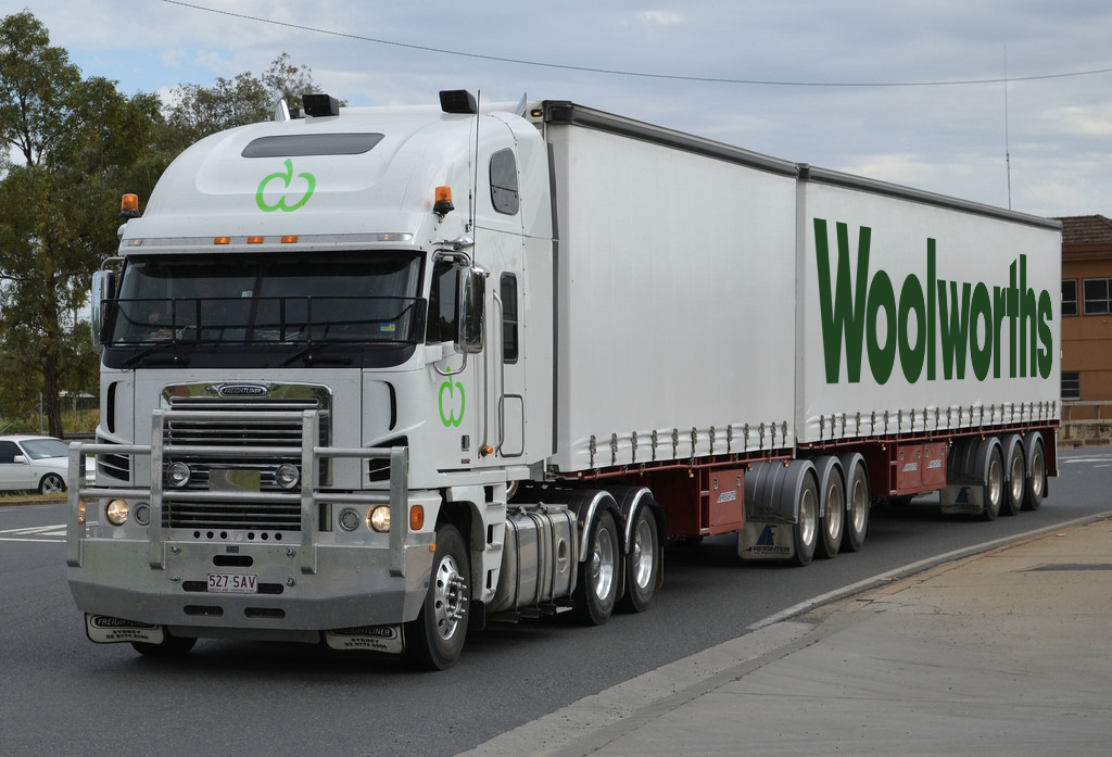
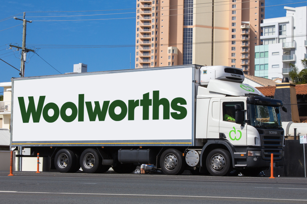
Below is the new symbol and logotype on transport trucks.
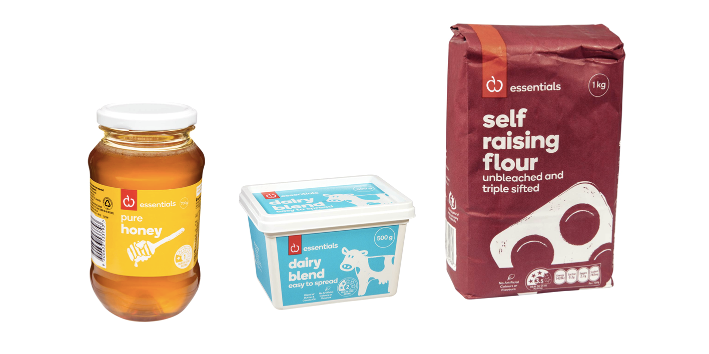
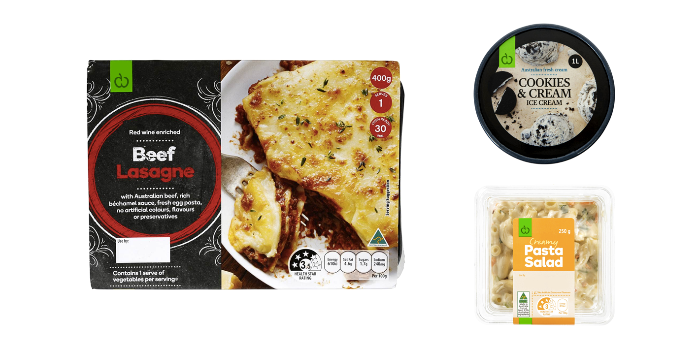
I have also redesigned the Woolworths Essentials and Food range logo, implementing the new symbol on the logos and products and changed the colours to appear more vibrant.

Keep in mind that Woolworths does not use the new symbol and logotype used above, but I would be great if they eventually pick it in the near future.
Thank you for watching!